SOP-42Q-MES0107 Operation Dashboard
42Q Home > Reporting > Operations Dashboard

This edition applies to the MES 15 4 Application and all subsequent releases and modifications until otherwise indicated in new revisions.
Contents
Description
The 42Q Operation Dashboard provides a quick look into various aspects of factory operations. It is useful for quickly identifying problems on the production floor and provides a global vision of a plant’s performance and capacity.
Operation Dashboard condenses productivity reports gathered from the MESWeb into 9 standard statistical charts that can be accessed remotely from Android tablets or viewed on large screens situated on the shop floor. Data is refreshed on the screen according to predefined parameters of 1 - 60 minute intervals. The reports are divided into 3 categories: Global, Product Family, and Top.
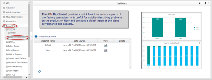
Operation Dashboard is accessible via MES Portal in the reporting module. (Reporting > Operation Dashboard).
Figure 1: Operation Dashboard: Welcome Screen
Profiles
Users can save reports as profiles, which include statistical charts, parameters, refresh rate, and customized parameters. Profiles allow the user to manage multiple dashboards with different settings separately for ease of use. The Dashboard includes 2 standard profiles (Demo and Default) and one customizable profile (New). With the New profile, users can create profiles according to their needs.
- Demo Profile: The Demo Profile gives users the opportunity to view short videos that explain the basic functionality in each section of the Dashboard.
- Default Profile: Default Profile directs users to the Dashboard Screen, where they may select data from all customers in the database. This option is preconfigured and ready for immediate use.
- New: The New Profile directs users to a blank screen where they can select which statistical reports to display based on their individual reporting needs. All customers in the database are available for selection.
Refresh the Profile List
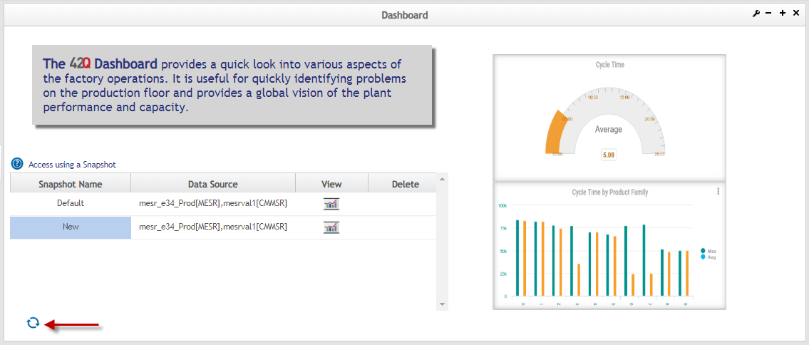
After making changes to a profile, select the Refresh button to update the profile list.
Figure 2: List of Profiles: Refresh Profiles
NOTE: Customized profiles are managed and visible only at the user level. They cannot be shared with others.
Typically, users have access to only one Data Source that is selected automatically by the system, based on predefined permissions.
Delete a Profile
To delete a profile from the list:
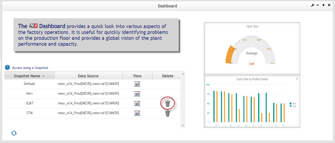
- Select the Trash can icon under the Delete profile for the chosen profile.
- Select the Refresh button to reload the Profile list. The deleted profile will no longer be displayed.
Figure 3: Profile List: Delete a Profile
Displaying the Dashboard
To display the Dashboard:
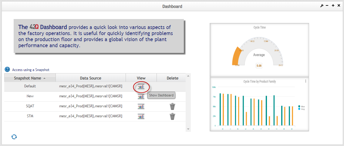
- Select a Data Source from the desired Profile.
Figure 4 : Select a Data Source
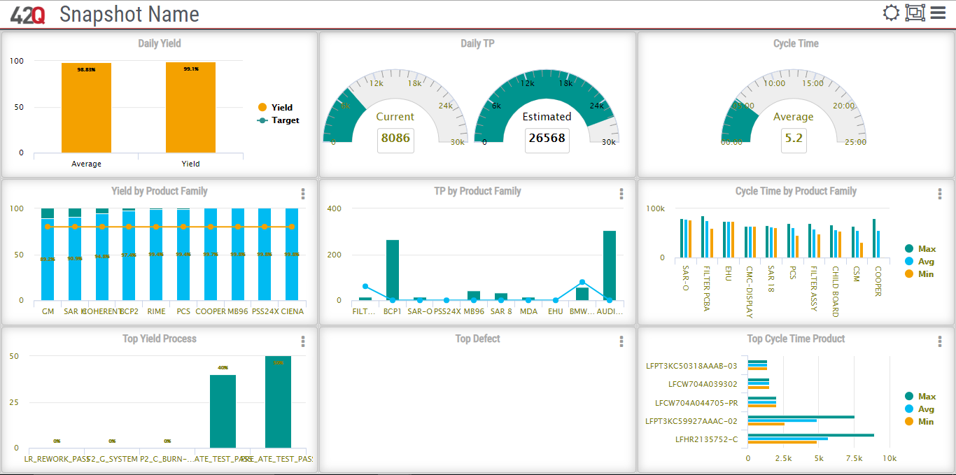
- Select the Go to Dashboard icon. A new window displays the default 3x3 grid of reports.
Figure 5: Default Operations Dashboard
Configuring the Dashboard
The Operations Dashboard allows the user to configure which reports to display, the refresh interval, and the length of data to gather for the report. By default the Dashboard shows average results from the past 6 days. Users may configure the system to display results anywhere between 1 and 14 days. Target value average statistics can be configured in the same way.
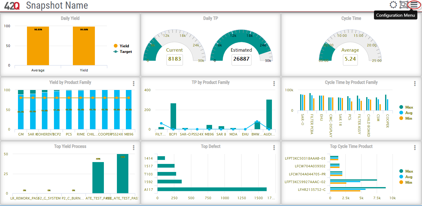
Figure 6: Operations Dashboard: Settings Menu
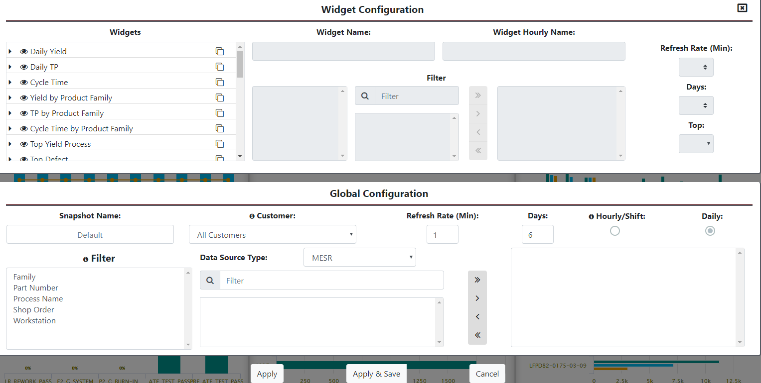
To configure the Dashboard in the Settings menu:
Figure 7: Settings Menu
- Select the navigation icon to open the Settings menu. (Refer toFigure 6)
- Select a customer from the drop down list.
- Select either the Hour or Day radio button to determine frequency of the report.
- By hour: Displays the data from the past 60 minutes.
- By day: Displays data from 00:00 to the current time.
- Select the space left of the report title to select or deselect the report. When the report is active, a green checkmark displays next to the report. When the report is deselected, a red x displays next to the report and it is removed from the dashboard.
- Select the yellow gear icon of the corresponding report, to set the Refresh Rate. NOTE: Hourly Yield/Hourly TP, and Daily Yield/ Daily TP include a Days option, which is used to specify how many days prior to display (6 to 14 days).
Figure 8: Refresh Rate
- Once all configuration is complete, select the Apply button. The dashboard window will automatically refresh with the new configuration and a Save Profile prompt displays.
Figure 9: Operation Dashboard: Save Prompt
The Save Profile pop up window allows users to:
- Save using the profile name assigned by the system.
- Save under a new profile name by typing the new name in the field.
- Overwrite an existing profile name.
- Select Save to complete or Cancel to refresh the window without saving.
Global Reports
Global reports provide plant level information regarding Yield, TP(Throughput), and Cycle Time. Reports shown are based on the Customer selected in the Settings window.
Daily Yield/Hourly Yield
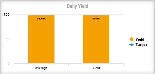
Daily Yield/ Hourly Yield reports compare current yield value against the average value of the last number(n) of days. Established target values are also displayed.
- By Day mode displays values from 00:00 to the current time.
Figure 10: Daily Yield
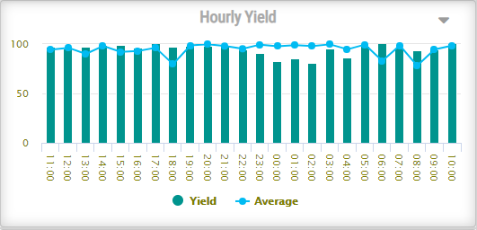
- By Hour mode displays yield and average yield values by the hour. Users can select whether to see the last 12 or 24 hours.
Figure 11: Hourly Yield
Daily Throughput/ Hourly Throughput
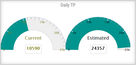
The Daily Throughput report displays the current throughput in the first chart and provides an estimated value to reach by the end of the day on the second chart. The estimated values are based on the current TP/hours worked.
- By Day mode displays TP values from 00:00 to current time.
Figure 12: Daily Throughput
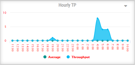
- By Hour mode displays the current TP value hour by hour for the current day, and the average TP during those same hours, but in the past number(n) of days. Users can select whether the report displays data from the last 12 or 24 hours.
Figure 13: Hourly Throughput
Cycle Time
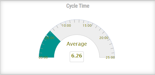
Cycle Time represents the average time to build a single unit on the shop floor. Cycle Time is charted by day or by hour, depending on whether By Day or By Hour is chosen in the Dashboard settings menu.
Figure 14: Cycle Time
Product Family Reports
The Dashboard has 3 reports with data based on Product Families:Yield by Product Family, TP by Product Family, andCycle Time by Product Family. These reports can be filtered to display a graph for a particular Product Family, Product, and Process/Line.
Filtering Product Family Reports
In each level of a Product Family report, the user is able to select which information to display, and whether to sort it by the Top 10 or the Top 5.
To filter a report:
- Select the vertical three dot menu in the top right corner of the report.
A list of Product Families, Products, or Processes displays depending on what is to be filtered.
Figure 15: Filtering Menu
- Select the radio button for either Top 10 or Top 5 to sort the list.
- Close the window to remove the window.
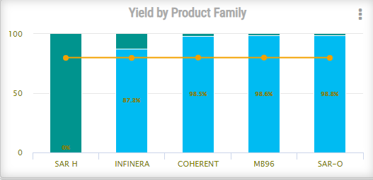
Yield by Product Family
The Yield for the Product Family report displays the % of yield for the filtered Product Family. The report can display further information by selecting a Product Family from the graph.
Figure 16: Yield by Product Family
- Select a Product Family from the report to load the Yield by Product report.
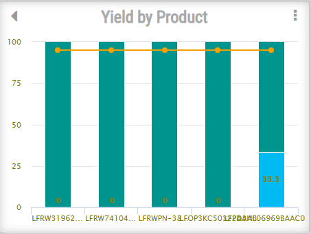
Yield By Product
The Yield by Product report displays information about the Top 10 or Top 5 (depending on the selection in the Filter pop-up window) products for the selected Part Family based on yield.
Figure 17: Yield by Product
From here, the user can select the back arrow to return to the Yield by Product Family report.
The user can also filter this report by Top 10 or Top 5 and choose which Products to display (Refer to Figure 15)
As with the previous report, the user can also see the Yield by Process for a Product, but selecting a Product from the graph.
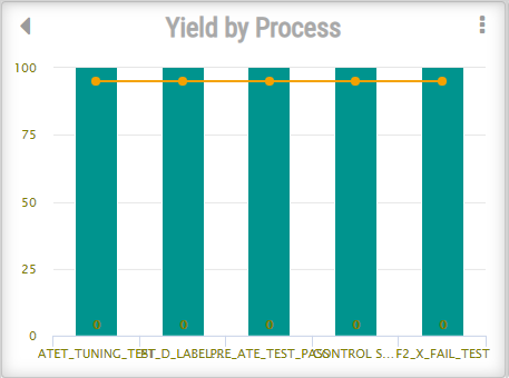
Yield by Process
Figure 18: Yield by Process
The Yield by Process report displays a graph for the Product selected in the previous level of report.
As with the previous report, the user can filter which data to display and whether to display the Top 10 or Top 5.
To return to the previous report, select the arrow in the top left corner(Refer to Figure 15).
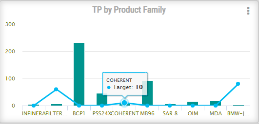
Throughput by Product Family
The Throughput by Product Family displays a report for either the Top 10 or Top 5 Product Families (Refer to Filtering Product Family Reports) based on their TP.
- To access the TP by Product Family settings window, select the menu icon on the top right corner of the report.
Figure 19: TP by Product Family
- Select a Product Family from the report to load the TP by Product report.
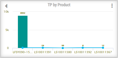
Throughput by Product
The TP by Product report displays the TP for the Products of the selected Product Family. As with the previous report, the user can set which products to display and sort them by either the Top 10 or the Top 5.
Figure 20: TP by Product
The user can either select the arrow in the top left corner to return to TP by Product Family report, or select a Product to load the TP by Line report.
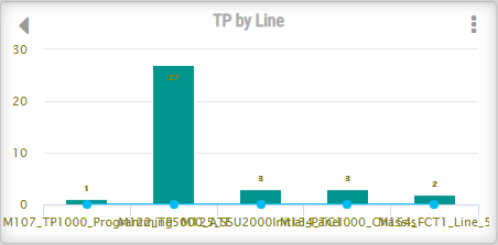
Throughput By Line
The TP by Line report displays the TP for the Line of the selected Product. As with the previous report, the user can set which products to display and sort them by either the Top 10 or the Top 5 using the 3 dot menu.
Figure 21: TP by Line
To return to the previous report, select the arrow in the top left corner(Refer toFigure 15).
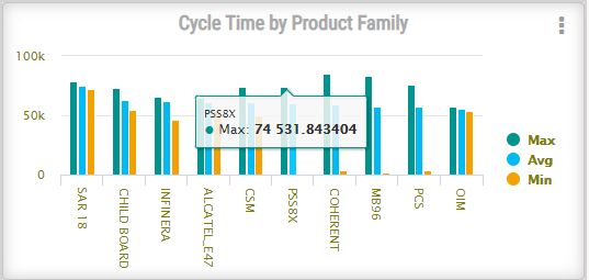
Cycle Time by Product Family
The Cycle Time by Product Family report displays the amount of time used to build a product, including the minimum and maximum values during the same period. As with previous Product Family reports, the user can select which Product Families to include in the report and sort them by either the Top 10 or the Top 5 based on their cycle times.
Figure 22: Cycle Time by Product Family
Access the Cycle Time by Product report by selecting a Product Family from the report.
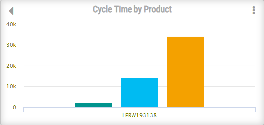
Cycle Time by Product
The Cycle Time by Product report displays the Cycle Time for the Products of the selected Product Family. As with the previous report, the user can set which products to display and sort them by either the Top 10 or the Top 5 with the 3 dot menu.
Figure 23: Cycle Time by Product
Cycle Time by Line
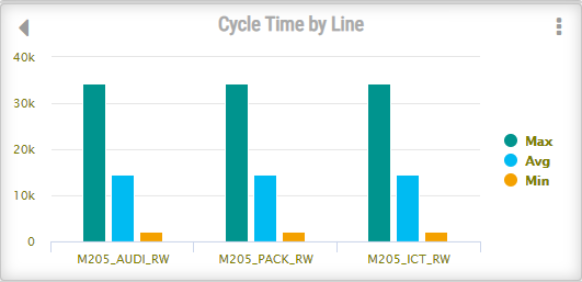
The Cycle Time by Line report displays the Cycle Time for the Line of the selected Product. As with the previous report, the user can set which products to display and sort them by either the Top 10 or the Top 5.
Figure 24: Cycle Time by Line
To return to the previous report, select the arrow in the top left corner (Refer to Figure 17).
Top Reports
The Dashboard includes 3 Top reports: Top Yield Process, Top Defects, and Top Cycle Time Product.
Top Yield Process
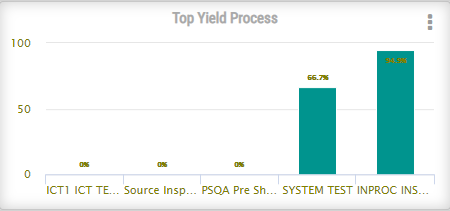
This report displays the top five processes with the lowest yield % making it easier for users to identify processes with problems.
Figure 25: Top Yield Process
By selecting the menu at top right corner users can select which of the 5 processes to display or hide.
Top Defect
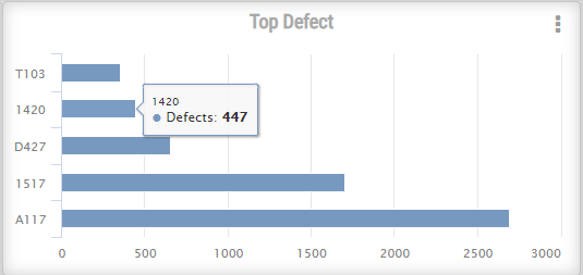
This chart represents the 5 most common defects in the last hour or day, depending the mode selected. Users may select which defects display by selecting the check mark in the display column of the pop-up menu.
Figure 26: Top Defect
Top Cycle Time Product
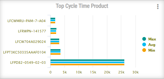
This report displays the top five products that took the longest time to build based on the average time to build the same product in the last hour or day. The Top Cycle Time Product report also displays the product’s minimum and maximum values. As with other Top reports, users may select which items to view by marking the appropriate checkmark in the Display column of the Report’s pop up menu.
Figure 27: Top Cycle Time Product
Document Revision History
| Date | Author | Title | Version | Change Reference |
| 08/08/17 | Lucas Hopkins | Technical Writer | A | This is the first version of Operation Dashboard for 42Q. |
